Infographics, Interactive Dashboards, Maps, Storytelling, and Videos

In today’s data-driven world, showcasing an organization’s economic impact is more than just presenting numbers—it’s about shaping perceptions, influencing decisions, and securing future investment. Successful demonstrations of economic impact can inspire stakeholder trust, strengthen reputation, guide policymakers’ decisions, and bolster internal and external support.
Whether you’re trying to reach lawmakers, investors, or internal stakeholders, you should communicate impact in an approachable, understandable way that highlights robust insights. Data visualizations, interactive dashboards, maps, storytelling, and videos are just a few ways to distill dense data while showcasing top-line, real-world implications.
Infographics
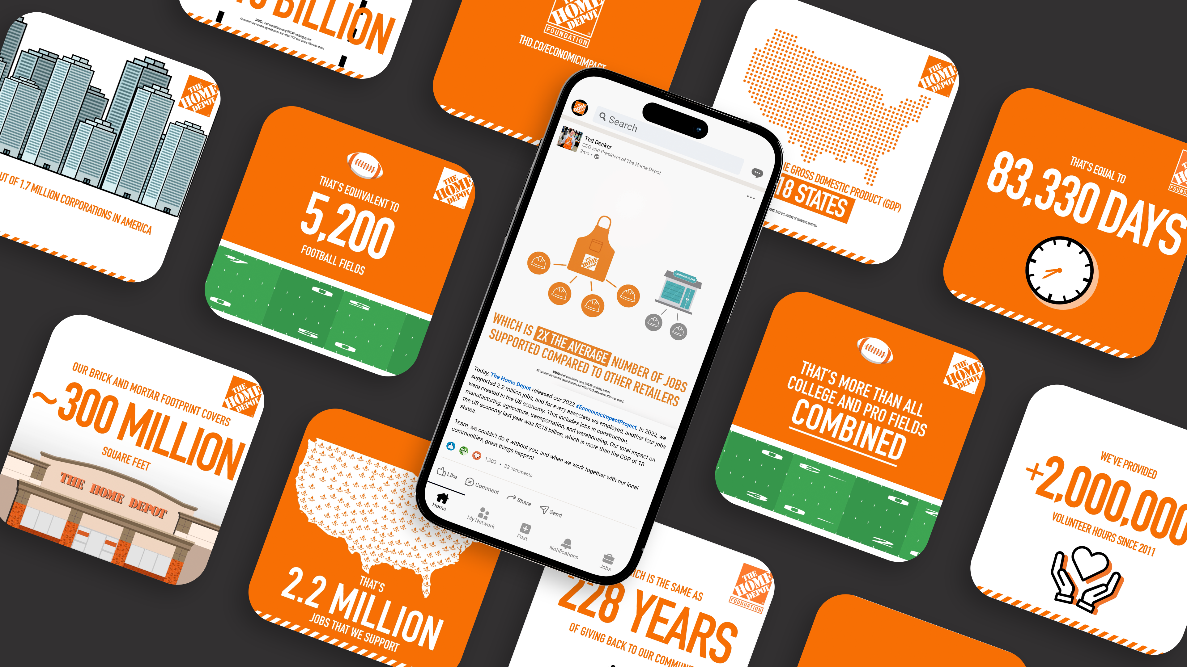
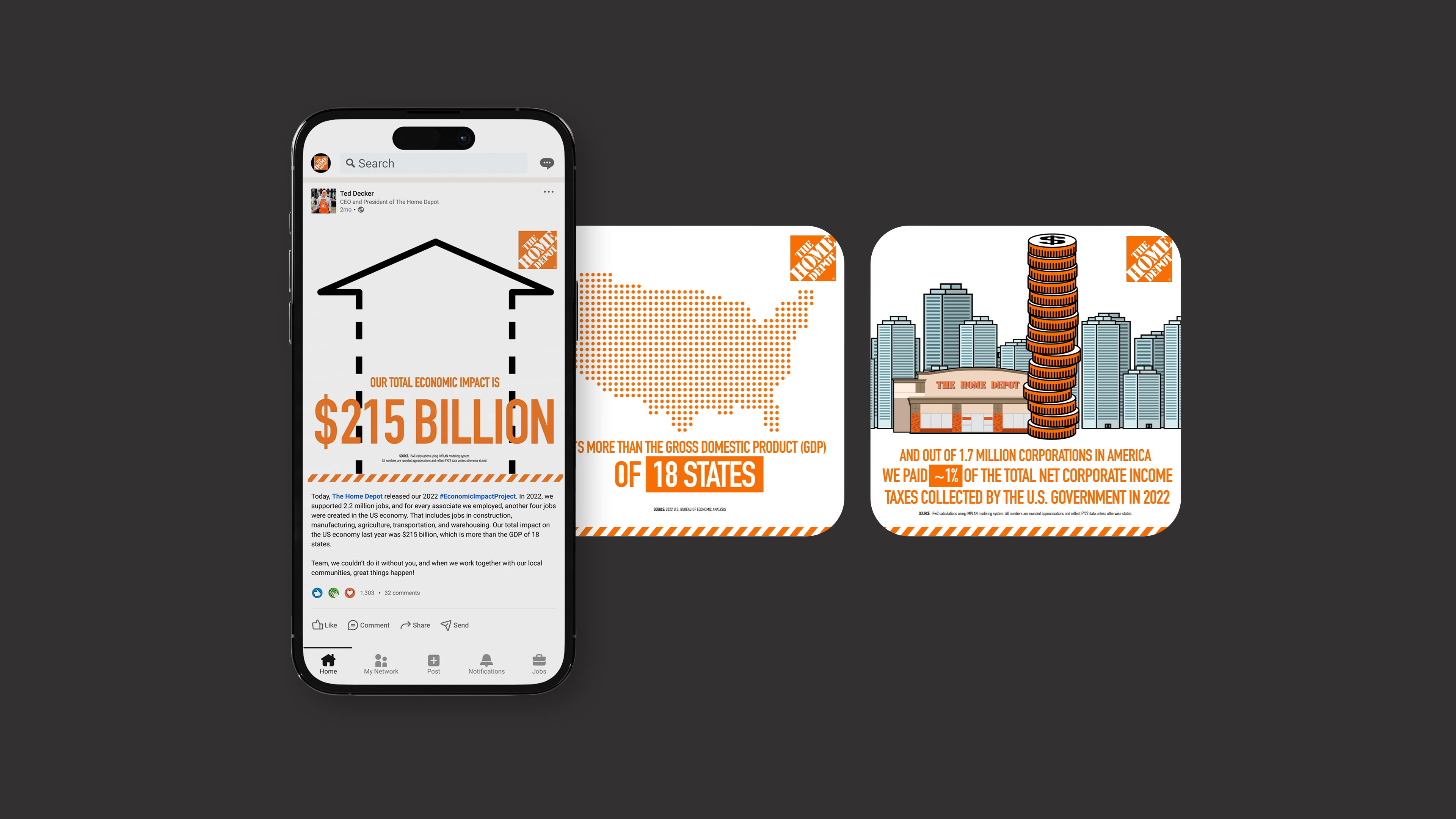
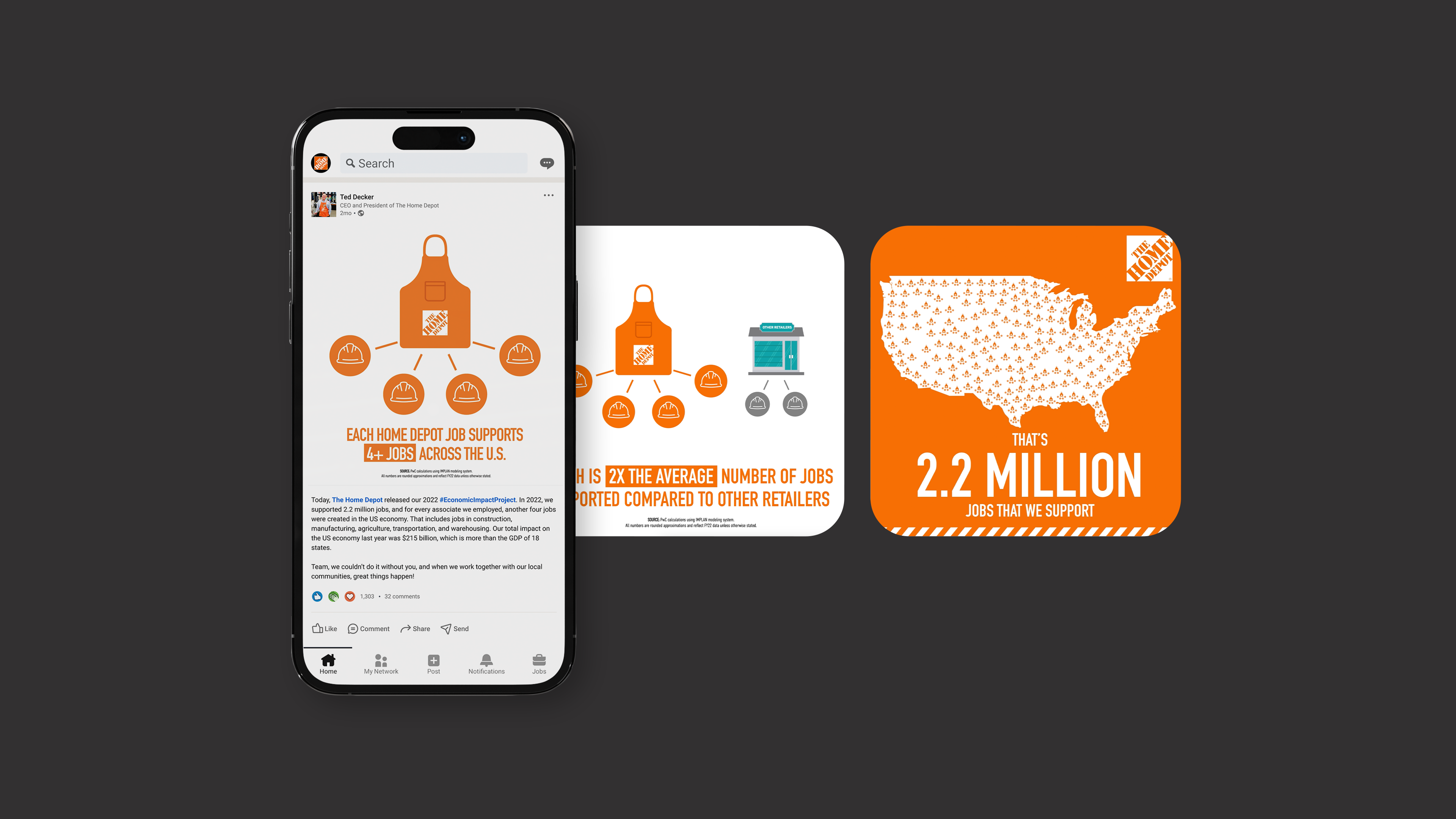
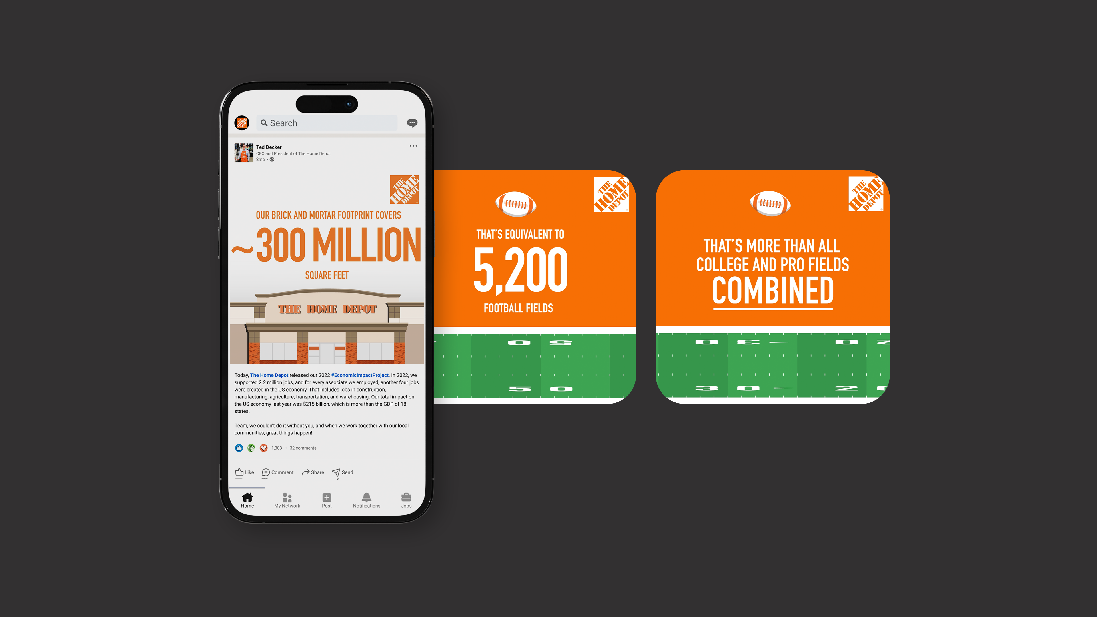
Animated charts and graphs can contextualize data, emphasize key points and patterns, and create an interactive experience to help viewers absorb a message. Coupling data with visual elements can help companies illustrate revenue growth, market share, cost–benefit analyses, and other economic trends. Icons, illustrations, and before-and-after visualizations that are simple and intuitive can make key statistics, such as job creation figures or GDP contributions, more accessible and digestible.
NJI recently supported The Home Depot in communicating their nationwide economic impact through a series of animated social graphics and state-level case study videos.
Interactive Dashboards and Maps
Interactive experiences offer an engaging way for key stakeholders to explore economic impact data. Dynamic elements such as sliders and dropdown menus can help audiences view different scenarios or trends across time. Web-based dashboards can offer deeper insights into how policy topics affect different sectors of the economy. Finally, interactive heat maps and geographic data overlays can compare impact metrics across different regions and allow users to click on hotspots or areas of interest for more information.
Storytelling
Narratives humanize data by illustrating tangible benefits for specific audience segments. For example, incorporating real-world examples of impact on small business owners can make data more relatable and compelling, reaching the hearts of stakeholders in a way that resonates. Narratives coupled with timelines, storyboards, before-and-after visualizations, and success metrics can further illustrate a project’s economic impact while fostering a stronger emotional connection to the message being conveyed.
Videos
Short, animated videos leveraging engaging visuals and narration bring economic impact messaging to life. Animated graphics can depict economic processes and changes, such as investment flows or market trends. Voiceover narration and text help to convey complex concepts and guide viewers through the experience.
At NJI, we often create short videos showcasing personal stories to illustrate economic impact on individuals and their communities. Pairing visual content with larger, detailed data packets provides audiences with a comprehensive view, while still offering quick, accessible, and relevant information.
NJI works with clients across industries to turn data into a compelling story that resonates with key audiences and supports organizational goals. Finding the right balance of quick, digestible visuals and longer, detailed briefs is crucial. Tailoring content format and length to specific events, situations, and experiences can help companies capitalize on moments with key stakeholders.
