A New Era in UX Design

Minimalism embraces simplicity with clear designs and open-space layouts. Since emerging in the 1950s, this aesthetic has evolved over time, with bold minimalism being the latest iteration. Bold minimalism combines the elegance of clean, spare design with dramatic, assertive elements to deliver a powerful punch.
It is often characterized by clear lines and shapes, deep contrast, a limited color palette, ample white space, and strategic placement of elements to amplify a central message.
Achieving the right mix of boldness and minimalism can be challenging. Designers seek a delicate balance between dramatic elements that deliver a confident message and simple aesthetics void of distractions.
Let’s Take A Closer Look
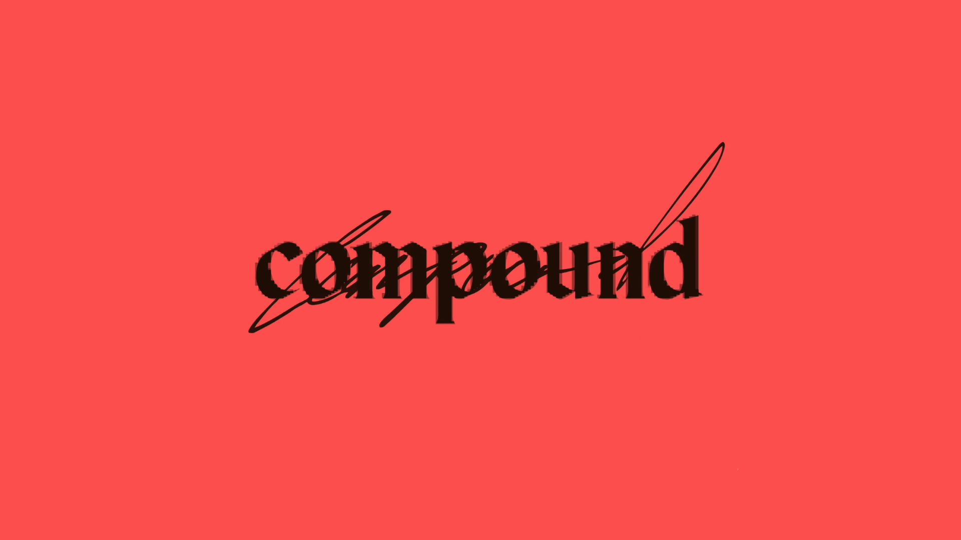
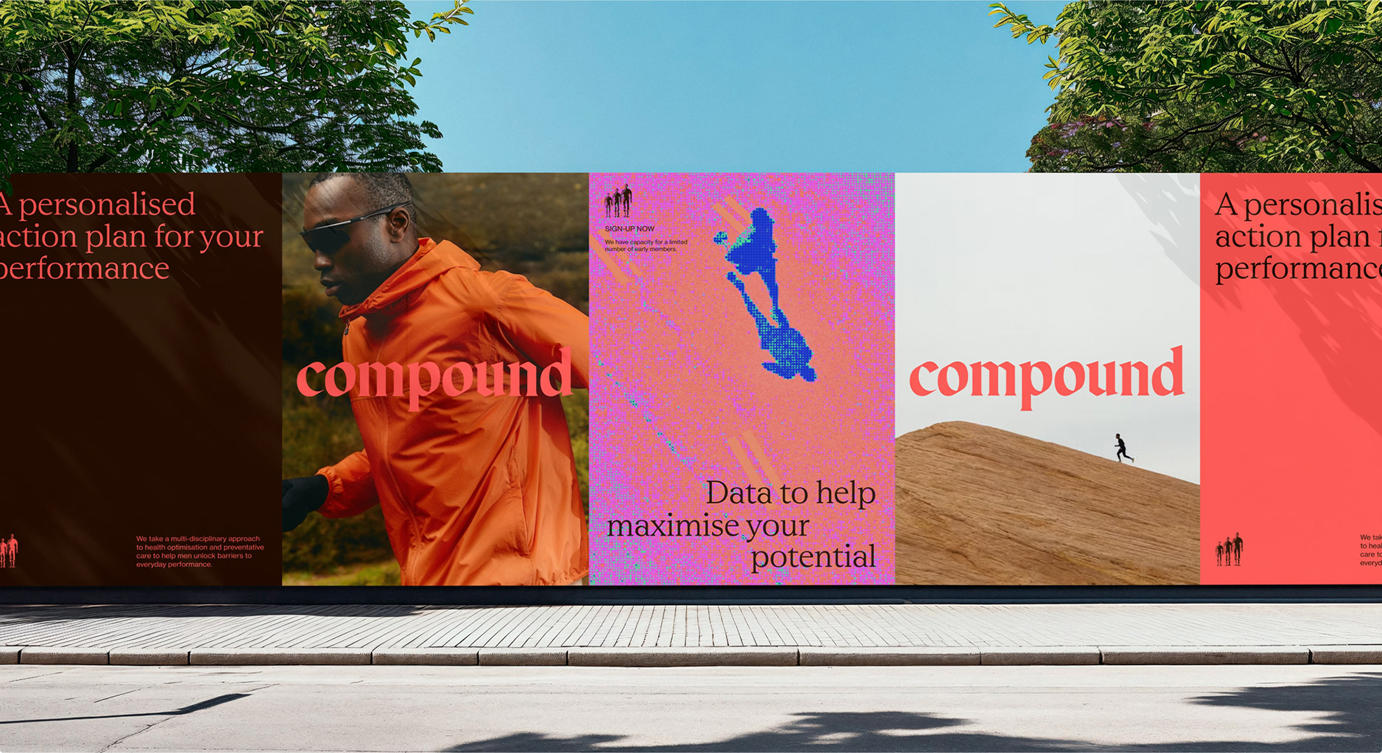
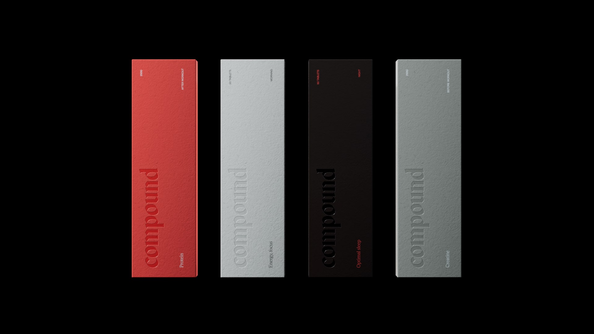
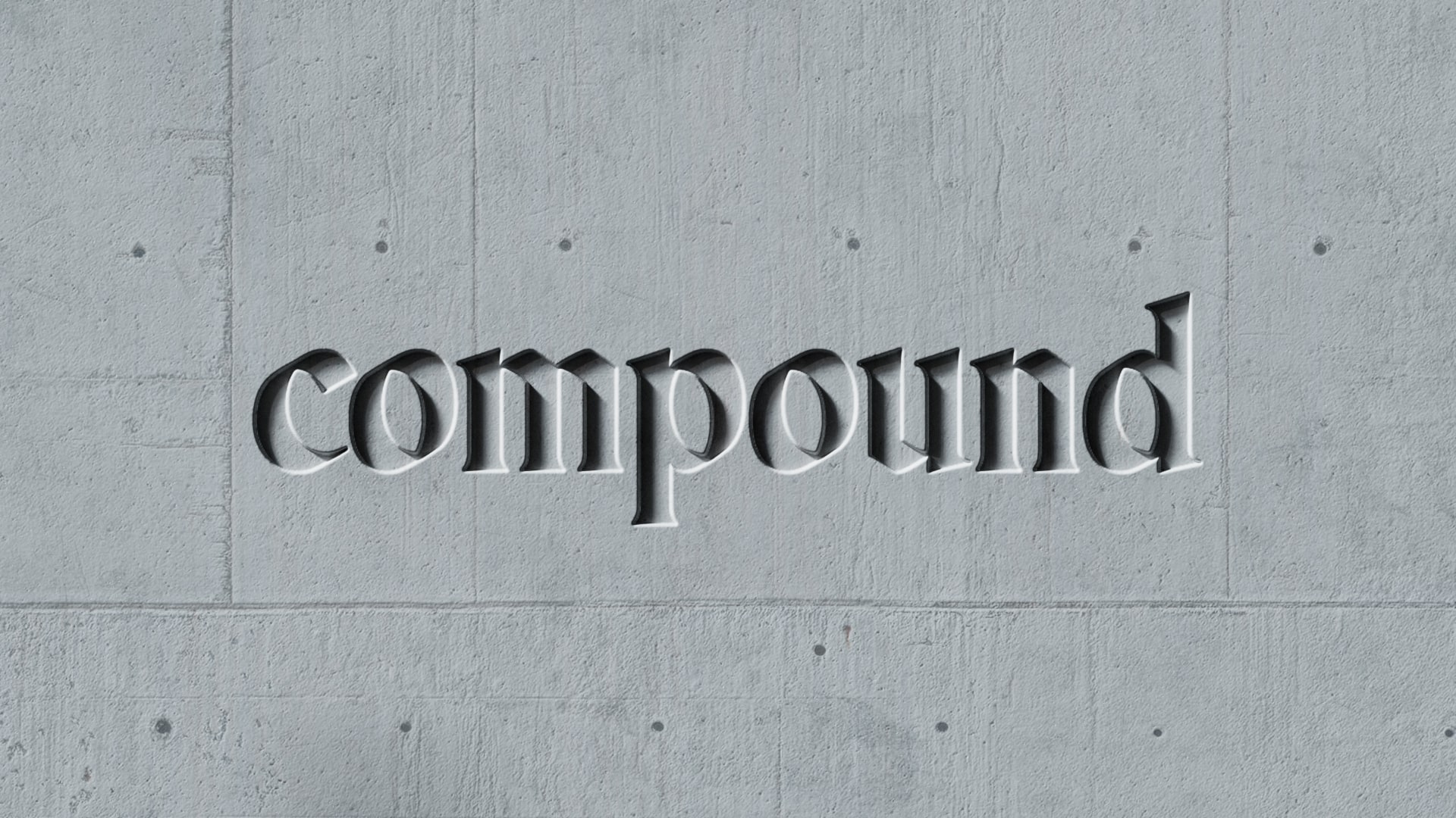
Compound, an Australian digital healthcare company, applies bold minimalism through a single, eye-catching color; white space; and photography focused on a central point of interest. The overall effect is an unmistakable message at the forefront of all branded assets.
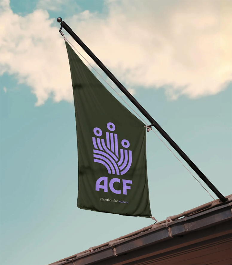
The Aruba Conservation Foundation features strong lines and clear shapes within a two-tone color palette in its logo and iconography. Together, these elements direct focus to the primary subject — species and ecosystems — and amplifies the organization’s call to action.
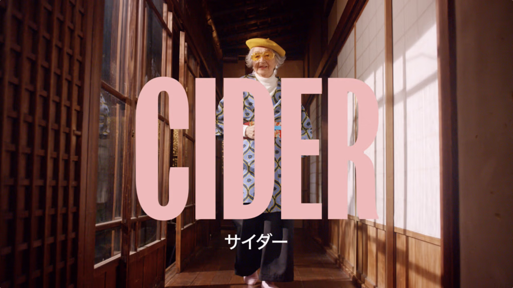
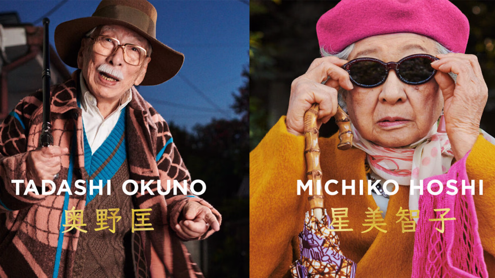
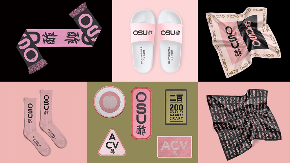
OSU combines direct, two- to three-word messages with a simple, pink color palette. Portrait photography juxtaposed with minimal typographic messaging focuses attention on OSU’s product.
Implications for Policy Marketing
In policy marketing, bold minimalism can be striking. Its simple yet loud style breaks through the noise to capture viewers’ attention. Once it grabs the viewer, it uses clear, direct visual cues to deliver easily digestible, memorable messages.
When creating a new brand for the Global Gaming Expo, NJI used this approach to emphasize the innovation and excitement of the evolving gaming industry. Distinct gaming iconography powered by vibrant, neon colors fostered a confident, playful tone.
