An Interactive Experience to Surprise and Delight
Embarking on a New Digital Journey
On June 17, 2024, NJI launched a new website as part of our larger brand evolution strategy. The redesigned experience reflects our agency’s global growth, evolved creative identity, and expanded design and development capabilities. Here’s an inside look at how we brought our vision to life.
Charting the Course

This was inspired by our ethos in business: offering white glove service and hospitality no matter the challenge or destination. We created the digital experience to feel like a well-hosted journey, where every click and interaction offers a white-glove service with a touch of unexpected delight.
Deluxe Features and Amenities
Our new website is packed with advanced features powered by cutting-edge tools and technologies to enhance usability and engagement.
Interactive Elements
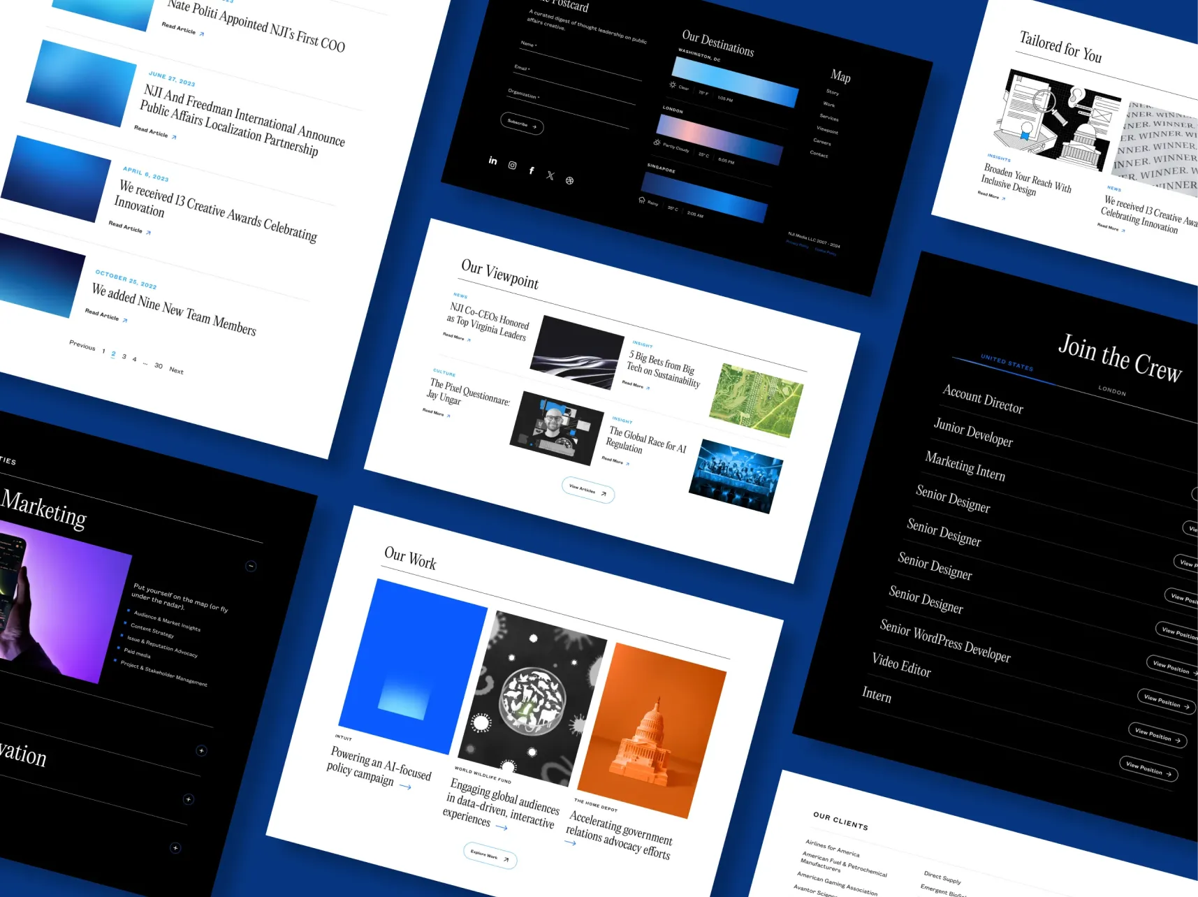
- The website boasts a wide array of interactive elements–such as accordions, tabs, carousels, sliding modals, and animations–to organize content efficiently, reduce cognitive load, and enhance visual engagement.
- We integrated dynamic animations using GSAP, an industry standard animation library, to power a smoother, user-friendly, engaging interface. We then used Lottie files to reduce the load time of animations, while maintaining quality and resolution.
- CSS-based hover effects and animated transitions further increase user engagement, while Swiper.js creates responsive carousel slides.
New Search Function
- Our new site-wide search feature gives users immediate access to the most relevant content within each section of the site. We enhanced search precision by integrating the Relevanssi WordPress plugin, which indexes custom fields, excerpts, and more to deliver highly relevant results.
- Results are also intelligently categorized by page type, making it easy for users to filter and explore content more effectively.
Expediting the Journey
We employed efficiency-driven enhancements to optimize website performance and streamline the development processes.
Image and Video Optimization
- We replaced PNGs, JPGs, and GIFs with WebPs–a file format produced by Google with lossless compression–to reduce image size, decrease load time, and enhance site performance without sacrificing quality.
- We further leveraged a Figma exporter plugin to batch export entire pages of visual assets in the file format we want, at multiple resolutions for various screens, while maintaining consistent naming conventions.
Component-Based Architecture
- We adopted a component-based architecture to streamline the creation of new pages with consistent, reusable elements. This approach speeds up the development process while maintaining a cohesive design style across the site.
Tools and Plugins
- We implemented several tools and plugins for enhanced personalization, user engagement, and accessibility. Every article and case study is followed by a “Tailored for You” section that offers related content recommendations.
- We also leveraged the AiAlt plugin to generate alternate image text and tags for all images on the website, enhancing site accessibility and SEO while significantly reducing manual time spent on content creation.
Unpacking Surprises at Every Turn
The website’s modern, interactive elements create an enjoyable, memorable user experience by gradually revealing new content and features in a fun, digestible way.
Animation and Illustration
- Thoughtful micro-animations and subtle illustrations within accordions, hover states, and sliding modals add layers of surprise and delight without overwhelming the user.
- Animated checklists, and scroll-activated annotations on headlines, and quotes brings language to life in a visual way.
- Designed badges reminiscent of passport stamps color jot across the website, providing a playful nod to the brand’s travel ethos.
- Etching inspired illustrations come to life with ambient motion elements to help guide the journey.
Dynamic Movement
- Image and text marquees add movement and a modern touch to the website, enhancing user engagement and delight.
- The weather API integration provides real-time forecasts for all of our office locations and dynamically adjusts the color gradients to match the weather conditions.
- The site was designed with strategically placed buttons and calls to action that use upward motion to subtly guide users from the bottom left to the top right of the screen.
- Motion throughout the site reinforces our angle motif, growth and forward motion.
Future Voyages
Our website is more than just a digital space—it’s an evolving experience. As we move forward, we’re excited to introduce even more interactive features, leverage AI to deliver personalized content, and continuously enhance accessibility to ensure our site remains inclusive and engaging for all users.